In short: A logo is a shorthand mark that helps people recognize a company, but it's only one piece of a larger system. Visual identity covers color, typography, logo proportions, image style, icons, and graphic elements, and how they're applied at every customer touchpoint.
What's the difference between a logo and a visual identity?
A logo can be good, but using it in inconsistent color shades, placing it on unsuitable backgrounds, or changing it from one printed piece to another makes a company look disorganized. Identity's job is to prevent that inconsistency by setting rules that make it easy to repeat the same image across channels.
When does a company need to build or evolve its identity?
New projects need an identity before producing print materials or a facade, while established companies may need to evolve one as services expand, the audience shifts, or current applications become inconsistent. Evolving doesn't necessarily mean discarding everything — it can start with organizing colors, type and applications while preserving the brand's existing equity.
It's important to define the reason for the project before design begins: is the issue weak brand recognition? Inconsistent execution? Or does the current look not reflect the service level? The answer determines how much change is needed.
Identity components that should be delivered
A project typically includes logo files fit for use, a color palette, typefaces, clear-space rules, usage sizes, allowed and disallowed backgrounds, supporting elements, an image style, and core application templates. The delivery scope is set by the company's actual needs, not a fixed list for everyone.
Companies also need organized files in formats suited for print and screens, with clear naming for versions and colors. An open file with no usage guide isn't enough, because any producer might interpret colors and sizes differently.
The brand usage guide
A usage guide shows how the identity actually works: correct and incorrect logo examples, color codes, typefaces, spacing, layout configurations, and selected applications. The more branches, designers or vendors a company deals with, the more this guide matters.
It doesn't need to be needlessly long — what matters is that it answers recurring questions and reflects the applications the company will actually use.
Applying the identity reveals design quality
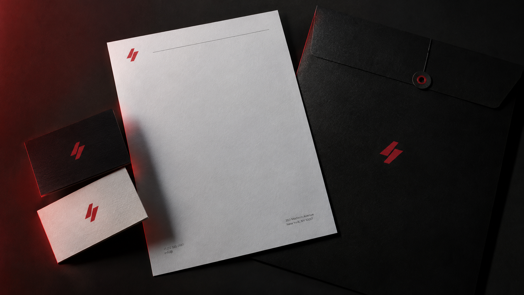
Identity isn't tested on a presentation slide alone, but on business cards, folders, catalogs, apparel, signage, vehicles, packaging, gifts and social media. Some solutions look great on screen but don't hold up under cutting, engraving, or printing on a specific material.
Art Zone's ability to combine design, printing, gifts, signage and production helps test applicability early. When the designer knows the limits of the material, printing, engraving and sizing, the design gets closer to what's actually producible, narrowing the gap between mockup and final result.
How to choose an identity design partner
Look at how well they understand the business and audience before looking at the visuals. Ask about the process, number of applications, delivery formats, the usage guide, and how colors will be checked at print time. The decision should be based on how well the identity can serve the company for years, not on a visual trend popular for a short time.
Also ask for examples of projects that reached actual production, not just mockups, via our portfolio — logo images alone don't prove the system works on print, facades and packaging.
Turn your identity into an executable system
Share your business information and the applications you need with Art Zone to get a clear scope that starts with the concept and ends with print-ready, production-ready files through our services. Contact us: 01115404818 or artzone-adv.com/contact.